There be Dragons
What an incredible time in the World stock markets, volatility(to the downside), pandemics, credit market collapse and an oil market collapse. First and foremost I hope that my readers are healthy and safe, in times like this if you and your loved ones are in a good spot then you have the most important thing in the world. The markets will do what they do without you and we can watch and observe and prioritize what is truly important.
If you are like me and trying to figure out what just happened and what will happen next I decided to put some thoughts down on paper so that I could look back in a year and laugh at myself. What was I thinking then. My observations(no sh** sherlock) is that we are in the midst of a second great financial crisis that will rhyme with the 2008 crisis even if all the events will not be same. There be dragons out there.
There be Dragons
Why did I think that there be dragons would be a good title for this piece when this is supposed to be a website that talks to the fundamental value of oil companies. Wikipedia says to the quote
“Here be dragons means dangerous or unexplored territories, in imitation of a medieval practice of putting illustrations of dragons, sea monsters and other mythological creatures on uncharted areas of maps where potential dangers were thought to exist”.
I thought this was appropriate to talk about at this point in time since we have to navigate these times an having a map to guide where to go with your investments and where to stay away from would be useful. There are investments that you have to stay away from when the credit markets seize up such as highly debt levered companies, and in the case of oil companies there is even more uncertainty with the service group as most producers will either be slashing budgets or some will go bankrupt. I believe that the service group is un-investable at this point in time and would be described as on the map where the dragons were drawn.
Before we look at the oil and service companies let’s start at the source of the crisis, not the pandemic, but the credit markets.
Credit Markets
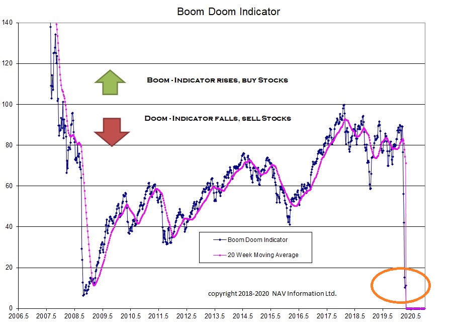
The thesis we have to start with in looking at the stock markets is that our Global economy is credit driven, with large amounts of debt owed by all parts to other parts of the economy. The TSX stock index is dominated by the financial services group(used to be oil companies) and if you are a student of the Austrian school of economics you know that this means the credit markets will drive the economy and the final blow-off a crack up boom followed by a bust. When the central banks start printing money either directly(quantitative easing) or indirectly by reducing interest rates the economy will grow and maybe even boom. If the credit market breaks due to mal-investment or inflation then the economy goes into a recession and the stock market moves into a bear market. This website encapsulates this in the Boom Doom indicator. This indicator has been my attempt at creating an indicator to show when to move in and out of the stock market. Recently the indicator fell to the same level as during the 2008 financial crises and dropped to that level in 1 month that took 1 year in 2007- 2008.
Long Term Market Risk
Of course the pandemic is the pin that pricked the bubble but the stress was happening before the pin came along. Lets go back in time with a long term graph that looks at the Stock Market(S&P 500), Credit Market Stress(St Louis Financial Stress Index), and MZM yearly growth(cash like items in the US Economy such as currency, savings accounts, checking accounts, etc.). The reason I pick these three indicators is that they help illustrate an action-reaction response in the US economy as the US Federal Reserve manages their economy, and the reaction of the stock market and the credit market. I was surprised myself when I put this together to see that the Fed starts increasing the money supply well in advance of the stress appearing in the credit markets. The follow on is the credit markets lead the stock markets given that they are larger and smarter.
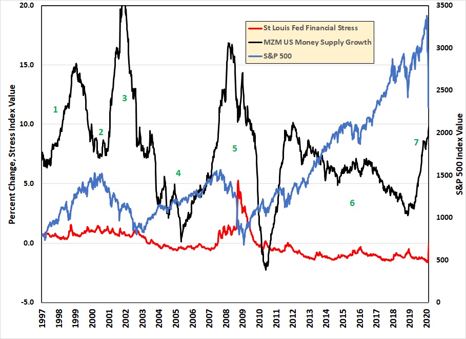
Historical Market Data, Data Source Yahoo, FRED Economic Data
For the purposes of discussion I created the graph back to 1995 so we could look at 4 periods of time, included the present time. These periods of time encapsulate key learnings about the credit markets and the response of the economy and the stock market. Follow along by looking at the black line first(money supply), Red Line(financial stress), and the Blue Line(stock Market). Follow along on the graph by looking at the appropriate green number for the time period.
- Asian Financial Crisis – If you can’t remember this crisis, in the 1990’s the Asian Tiger economies imploded after a credit and property bubble. Leading up to this the Fed increased the money supply and the US stock market dropped about 20%. Since the crisis was in Asia, credit markets quickly recovered, the market correction in the US was temporary, and the additional money supply launched the……….
- Technology Bubble – The stock market jumped 30 to 100% under the juice of the additional money in the economy. The Fed realizing their mistake dropped the money supply growth to a more modest number. This was the pin that caused the over-valued stock market to implode and launching the……
- Bursting of the tech bubble – Tech stocks that were trading at 100x earning or based on clicks or made up ideas imploded. The rest of the economy had a mild recession due in part to the additional money supply now pumping out from the federal reserve. Banks were in fine shape and the housing market as well and with the interest rates dropping to historical lows this launched the………..
- Real estate Bubble – Now this is where it gets interesting. The amount of money created to reflate the economy after the tech bubble bursting was larger than normal.(seriously 20% a year, give me a break) This money went into the housing market in the US and the Oil industry in Canada. Remember $120/bbl oil? Now the Fed put the brakes on and slowed the growth in money supply to very low levels, maybe low enough to cause the over-levered financial system to have problems, and it did leading to the……………..
- Great Financial Crisis 1 – The stress in the financial markets started showing up in 2006, the Fed gently started increasing the money supply slowly and then more rapidly and all was well until 2008. This is when you can see the financial stress indicator start to jump much higher. It took the stock market until later in 2008 to implode, even as large amounts of money was being created to back stop the banks and financial markets. Finally the financial stress dropped indicating the amount of money was sufficient to keep the wheels on the train and the stock market came roaring back leading to……………
- Everything bubble – You can see the money supply lurching up and down until it finds a happy medium that kept the financial stress at bay and the stock market growing to new highs. Housing prices went on to new highs, bit coin boomed, Marijuana stocks launched, and swiss bank accounts were filled and all was well. After many years of this the Fed decided that it had “fixed” everything and started to withdraw money from the economy. Like an addict on heroin though this led to the present day……………..
- Great Pandemic and Financial Crisis 2
In order to see the detail I created a blow up graph of the last 2 years to see what has been happening.

Recent Financial Indicators, Source Yahoo and FRED Economic Data
- In period 1 everything is fine and the Fed is slowly reducing the growth of money supply to prevent future inflation and get ready for the next downturn. This eventually causes something to break as………..
- Credit markets back up a bit and the stock market plunges 20%. Realizing that they made a mistake the Fed stabilizes the growth in money supply and then around Aug 2019 the growth rate starts to ramp up. The credit markets seem OK so obviously there is some other problem brewing that we are not told about or no one has a clue about(I vote for the no clue). The stock market is quite happy about this additional money and launches forward to new highs, but…………..
- Along comes a virus stopping the world economy. Well that could be the problem but it also could be $250 Trillion in debt around the world waiting for some shock to cause it to seize up the banks. Now the credit stress spikes to levels last seen in 2008 and the present day.
When will it end
Now that we have a thesis about what caused the present day scenario, let’s explore what will signal the end and recovery. Money supply growth works with a large lag of up to 1 year before it impacts the economy as you can see from the previous graphs. During the 2008 financial crisis the money supply growth reached 15% at the start of 2008 and that did not prevent what happened next with the stock market dropping 35% after that peak. We need to look at the financial risk indicator(Boom Doom) and other leading market numbers to guide our decisions. We need a map to tell us where the dragons are to sail around the coast and get home. Let’s have a look at the financial stress indicator and gold during great financial crisis 1.
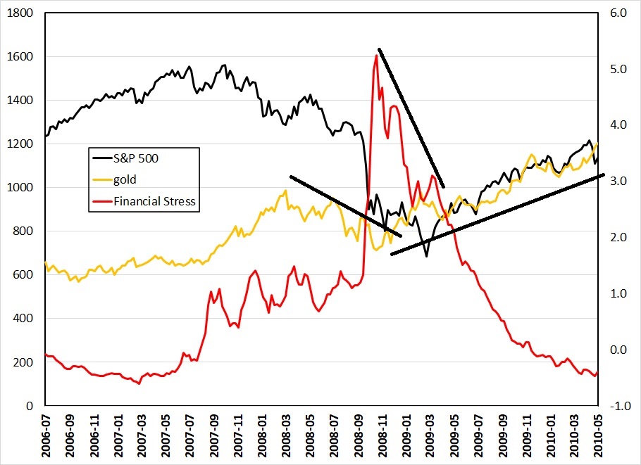
Gold plus indicators, source Yahoo and FRED Economic Data
Looking at the 2008 period there are a couple of things that jump out at me about that period. The first is that as long as the financial stress was increasing both gold and stocks were going down. This is an indication of liquidation as stocks and gold were sold to raise cash for margin calls and to pay debt that suddenly couldn’t be rolled over into new debt but had to be paid back. I drew a rough trend line to illustrate gold going down in price. Finally the stress started to drop, and first gold bottomed and started to rise. Then stocks started to rise with a delay. Although the magnitude of the rise was similar, the ability of gold to lead the rise in stocks could be useful if it happens again this time. So look for the credit spreads to top and start to trend down using the OAS high yield spread, Junk bonds etf or the St. Louis financial stress indicator. Then to confirm that this has happened look to gold.
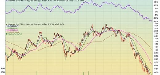
Oil Stocks
All of the previous drivel was to show you where the dragons were and maybe when they have moved on. If you want to make the most amount of money you have to go where the dragons are and navigate some rough water. The oil company and oil service company market is right in the middle of the dragon nest. In fact I would maintain that based on some previous work and a post, What Moves the Price of Oil, you should wait for OPEC to cut before venturing back in this market because without that cut this whole sector is un-investable. If you want to venture here in the next few months I would go to the DataTable that I maintain on this website and look for companies with low debt to cash flow, or no debt. These will be the survivors. There are many companies that will go bankrupt and the shares will go to zero. Remember during an oil price collapse 2x debt to cash flow can go to 6-8 x as the cash flow dries up.
So there you have it in a long a rambling blog. The credit markets have seized up and financial stress is as high as during the financial crisis of 2008. At some point in time they will print enough money to unclog the system and all will be well. Stay safe and healthy and hold cash to pick away at bargains when you see them, and there will be many bargains and opportunities to make lots of money, but wait until the risks have abated. As always remember I am not a financial adviser and have no special credentials or certificates to advise you on your investments. Please consult a qualified financial adviser before you make any investment.
I am happy that you posted this. I will be back to see when the dragons have left