What Moves the Price of Oil
Recently I was wondering what market indicators should be followed to anticipate that the oil bear market is over and the market is moving to a more balanced state. The first few things that go through your mind are production, inventories, OPEC announcements, product inventories. So what follows is a graphical look at what I saw as the data was downloaded and graphed.
The Asian crisis of 1998
To look at a price shock that I can remember I think it is useful to go back and look at some events in the past when the oil price plunged and what happened to various indicators during that time frame. During the crisis of 1998 the economies of Asia plunged into a crisis where some countries could not even raise the foreign currency to import oil, so demand dropped and so did the price.
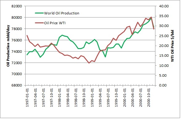
1998 World Oil Production and Price, Data EIA and Federal Reserve Economic Data
As you can see in the graph the price dropped to just above $10.00/bbl before finally recovering. You can also see that world oil production dropped twice over that time period, in total by 3.0 million bbl/day in cuts by OPEC to force the price higher. Production is a good indicator. What is also interesting that as the World economies recovered production rose shortly after to above the previous high with no change in the price. Now lets look at some inventory numbers.
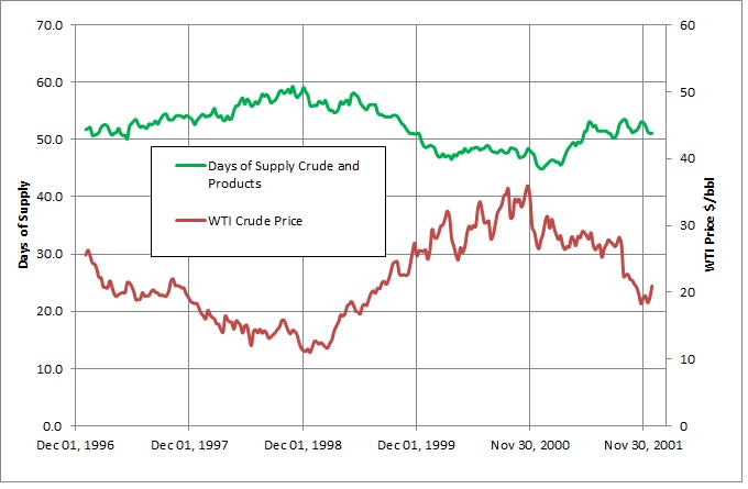
1998 Days of Supply and Crude Price Data EIA and FRED(Federal Reserve)
On this graph days of supply in the US shows why the first cut in production had no effect, the days of supply kept rising. The second cut showed up in the inventories with a lag so the fundamentals show why the price kept rising even though production was rising as well.
Financial Crisis of 2008
Now lets jump forward to 2008 to have a look, first at production.
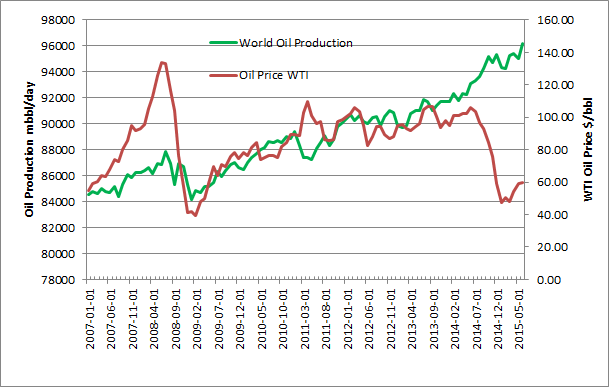
2007 on World Oil Production and Price, Data EIA and FRED(Federal Reserve)
After the price spike to $140/bbl the price collapsed and then OPEC cut production by 2 million bbl/day. The production cut was promptly followed by a climb in the price of oil. Also you can see in this graph more recent times where oil production has continued to climb even though the price has dropped. With this analysis without a drop in production the oil price could languish “lower for longer”.
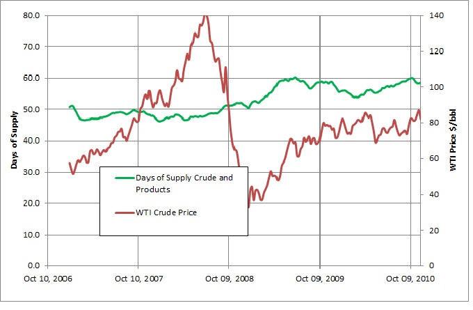
2008 Days of Supply and Crude Price Data EIA and FRED(Federal Reserve)
The days of supply graph is a bit more unclear if you want to predict what happens next since the price of oil rises even though the days of supply is also climbing. Later on into 2010 though the days of supply starts to drop so the climbing production does not cause the price to collapse. What about more recent times.
Recent Times
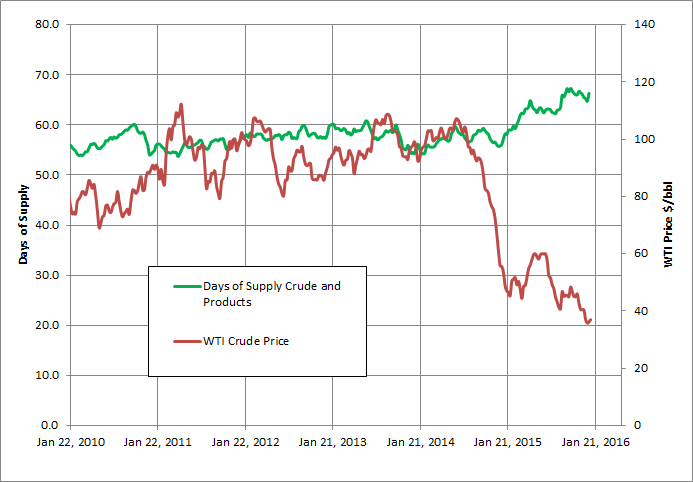
2015 Days of Supply and Crude Price
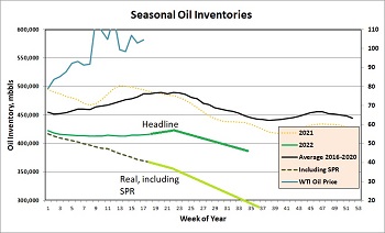
In more recent times with this graph the price started to collapse even though inventories didn’t move, probably due to the OPEC announcement that they would increase production and gain market share. In this case the climbing production came first, the market anticipated the rise inventories and the price collapsed. So far the inventories are still high and climbing. One thing to look at in more detail is how the inventories move with the time of year, as demand for oil goes up and down. In this case I built a seasonal comparison graph.
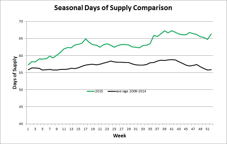
Seasonal Days of Supply Comparison, Data EIA and FRED(Federal Reserve)
In general from the 41st week of the year on, days of supply drop. In 2015 they did drop slightly but not as much as generally happens so the price of oil stayed soft.
So now you have it the summary of why these graphs are now in the oil production page as a gallery. They will be updated on a periodic basis to follow the oil markets and see if we can anticipate what happens next. As an aside the gap between the line of about 10 days would take 200 days to close with a supply gap of 1 million bbls/day, so lots of time to react.